Monday, 13 January 2020

Newton Method

The Newton method (or Newton-Raphson Method)is an algorithm that allows one to find the roots of an equation when solving the equation (f(x)=0) is not an option.

The general form of the algorithm is here:
$${b_{n} = b_{n-1}- {{f(x)}\over{f'(x)}}}$$

$$end:f(x) < err$$

It is simply an arbitrary starting value less the function of the value over the derivative of the value.The idea is that the result of the first iteration feeds into the subsequent iteration, and the process terminates when f(x) < err threshold.
We start with parameter b0 and an error threshold which remains constant.

We want to find the x intercept of the following function
$$f(x)=-x^3+2x^2-e^x$$


We will need its derivative
$${{df(x)\over{dx}} =-3x^2+4x-e^x}$$

The form of the algorithm will look as follows:
$${b_{1} = b_{0}- {{-x^3+2x^2-e^x}\over{-3x^2+4x-e^x}}}$$

We arbitrarily set b0 as 10 and the error threshold to .001

I will print the values out instead of computing the algorithm with MathJax.

b0: -6.47058884010279  fx: 354.649469421832  fxdx: -151.489463487155
b0: -4.12950543233229  fx: 104.509232053146  fxdx: -67.6925579111767
b0: -2.58562475655285  fx: 30.5816407170309  fxdx: -30.474214161426
b0: -1.58209959409794  fx: 8.76059234819741  fxdx: -14.0430588411127
b0: -0.95826169330173  fx: 2.33291052253774  fxdx: -6.97140224182995
b0: -0.623621624975194 fx: 0.484337035554275 fxdx: -4.19719802152472
b0: -0.508226298600212 fx: 0.046298105996643 fxdx: -3.4093487299717
b0: -0.494646547843232 fx: 0.000591761687825487 fxdx: -3.32239821278166
-0.4946465

The value of x where f(x) = 0 is ~ -.495. This can be seen in the above graph where the blue line intercepts the x axis.

R Script
library(ggplot2)

#Function
f1_x <- function(x) {
  return (-x^3+2*(x^2)-exp(x))
}

#Derivative
f1_dxdy <- function(x) {
  return (-3*(x^2)+(4*x)-exp(x))
}

#Load data
dfFX <- data.frame(x=seq(-2.5,2.5,.01),f1_x=f1_x(seq(-2.5,2.5,.01)),
                         f1_dxdy=f1_dxdy(seq(-2.5,2.5,.01)))

#plot the data
ggplot(data=dfFX) + 
  geom_line(aes(x=x, y=f1_x),size=1,color="blue")  + 
  ylim(c(-2.5,2.5)) +
  xlim(c(-2.5,2.5)) +
  geom_vline(xintercept=0) +
  geom_hline(yintercept=0) 

#The Newton Method - caps N
NewtonM <- function(b0,err,fx=f1_x,fxdx=f1_dxdy) {
  b0 <- b0-(fx(b0)/fxdx(b0))

  print(paste("b0:",b0,"fx:",fx(b0),"fxdx:",fxdx(b0)))
  
  if (abs(f1_x(b0)) <= err) {
    return(b0)
  }
  if (abs(f1_x(b0)) >= err) {
    return(newtonM(b0,err))
  }
}

Geometric Distribution

I've discovered the geometric distribution, it looks very handy.

$$E(X) = {1\over p}$$
$$V(X) = {1-p\over p^2}$$
$$P(Y=y) = {(1-p)}^{y-1}p$$

If I have a cheap laptop with an in built failure rate of 1% percent per month (per factory design),  I can find the probability of it failing in exactly 2 years time. Here, p=.01, and y=24

Therefore,
$$P(Y=24) = {(1-(.01))}^{(24)-1}(.01) = 0.008 $$

If I want to know the chances of it failing before and up until that point, then I need the cumulative sum of P(Y=y) = 1,2,3,4,..,24
A shortcut to get this value is

$$P(Y<=y) = 1-(1-p)^y$$
$$P(Y<=24) = 1-(1-.01)^{24}=0.214$$

In R, I can plot this as follows

library(dplyr)
library(ggplot2)

dfGeom <- data.frame(x = 1:24, y = pgeom(1:24-1,.01))

ggplot(data=dfGeom, aes(x = x, y = y)) + 
  geom_bar(stat = "identity", position = "dodge") +
  geom_text(aes(y = y+.02, label = round(y,2), 
                x = as.numeric(x))) 
 

Meaning, chances of failure approaching year 2 and beyond is ~.2


Saturday, 11 January 2020

Birthday Problem and other R snippets

Birthday problem solver code for R. I need a place to store this for future. I am working through second year statistics and will post other interesting things in this page as time goes on.
Here is a link to the full explanation.
In summary
You need 23 people to have at least a 50/50 chance of having a clashing birthday. See the graph below to see how that dynamic works as n increases.
#[1]: 10 people - number of possible birthday combinations
365^10

#Chances of a single combination of interest occurring
1/365^10

#number of combinations within sample space [1] having a unique birthday
(365)*(364)*(363)*(362)*(361)*(360)*(359)*(358)*(357)*(356)

#probability of no one in the room having the same birthday
distinctTuples <- function(elements,sampleSize) 
{
  n = sampleSize
  n_a <- elements
  
  for (x in 1:(n-1)) {
    n_a <- n_a*(elements-x)
  }
  
  return(n_a)
}

distinctTuples(365,10)

#Wrap the distinct tuples up and subtract from one to figure out the birthday problem
birthdayProblem <- function(numberOfPeople) {
  return (1-(distinctTuples(365,numberOfPeople)/365^numberOfPeople))
}

#Print the results
birthdayResults <- lapply(2:50,birthdayProblem)
plot(x=2:50,y=birthdayResults, type="l",main="Birthday Problem", 
     xlab="Number of people", ylab="Chance")

#Binomial distribution function where n=sample size, p=success chance, y=number of 
#successfull outcomes
calc_binomial <- function(p=1,n=1,y=1) {
  q <- 1-p
  s <- factorial(n)/(factorial(y)*factorial(n-y))
  p <- s * (p^y) * (q^(n-y))
  return (p)
}


plot(x=1:20,y=calc_binomial(.5,20,y=1:20), type="l",
     main="20 Coin flips and count of heads per trial", xlab="Number of flips", 
     ylab="Chance")

#quick factorial
easyFact <- function(n,y) {return (factorial(n)/(factorial(y)*factorial(n-y))) }

Output


Sunday, 5 January 2020

Lack of posts

I did not post anything for 2019 and very little for 2018. There are a few reason for this but ultimately, it boils down to being very busy and engrossed in my work and studies. I travelled a lot in 2019 too. Another important reason is I do not have a notebook. This makes the opportunities for posting a bit less. Lastly, I do not post items at work as the place is secretive. Unlike in the past where I would make posts all day long, this cannot be done and their exists a strong barrier between content at work and content at home.

I will aim to work around this in 2020. I still need to post images from Thailand and the UK.

Patong

London

PhilosophiƦ Naturalis Principia Mathematica

Making a distribution function and a supporting lookup table

*UPDATE: So I thought I was being clever doing this post, but I see in the book I am reading (Wackerly - Mathematical Statistics) there are demonstrations as like the one below, but more neat and academic. I've added an addition on working out the mean and variance for this make believe distribution, it is found shortly after the integration exercise.

One of the gaps I've experienced in introductory statistics courses is that often a new student is bombarded with several disparate ideas and concepts in the hopes that the ideas are tied together by the student. This can be frustrating, and one can often feel overwhelmed. The 'ah ha' moment doesn’t come until a student spends a bit of time with integral calculus and mathematical statistics to see how all the ideas are connected. 


Gaussian, Poisson, binomial, exponential distribution functions, z and t tables – introductory statistics courses teach these things as separate (which is understandable), but which are never really connected until second year. Cook book statistics is a term often used to describe the approach. This leaves us with the idea that these tables and curve are different from another and work in pairs, but really they are very similar when you look under the hood which is the aim of this post.

So, today I will try my best to create link between a real data histogram, it’s function and its table through example: I'm going to make my own distribution function from the ground up and hopefully the links are illuminating as to how different distributions and tables are connected. It’s a toy distribution and built for a VERY specific purpose – there are no parameters. Variance is assumed to be fixed along with the mean owing to the data source. You don’t need to understand calculus, but I’ve included it to help if you’re familiar with it. It’s merely used to get the area under curve.

You will find the R code at the end.

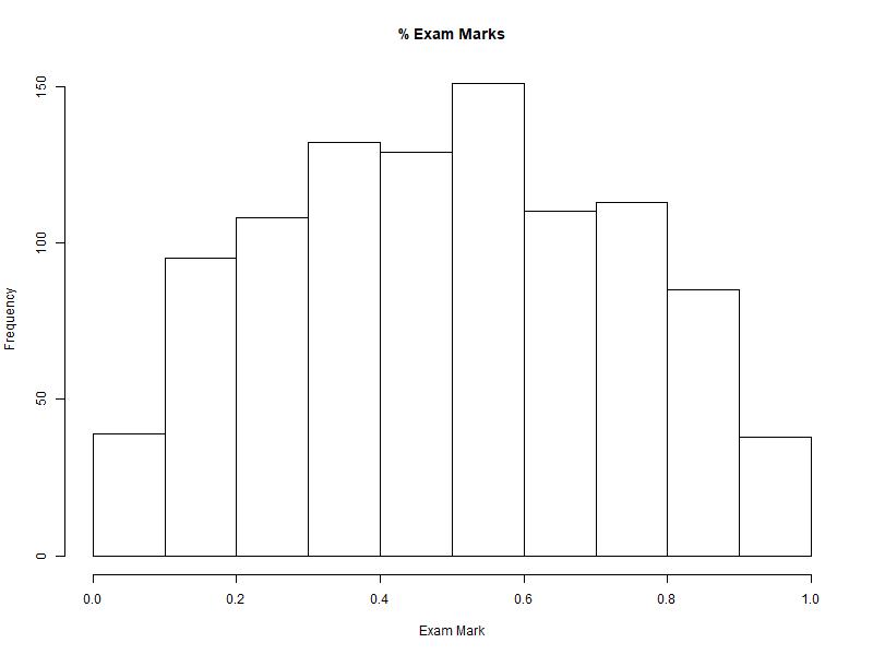
For this demonstration, we’re going to look at the distribution of university exam marks for all classes for a year. We have recorded 1000 marks and we see the following histogram:


We’re asked to find the probability that a student will earn a 70% or higher.

To do that, we would need to have some sort of distribution function that roughly fits the histogram.
Again, we don’t have a Gaussian distribution, so we need to make our own. After brute forcing a few quadratic equations in excel with intercepts 0 and 1 (-x)(6x-6), I find the following curve that seems to loosely fit the histogram.

\(f(x) = -6x^2+6x\)


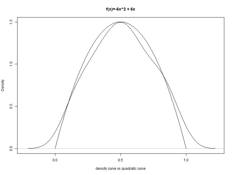
If I take the density plot of our sample data, and then place the new function next to it, I get


Not bad. Not perfect, but good enough for this task. So we have a function, and the area under the function’s curve matches roughly the density of our histogram. Visually, we need to find the following – the area in red represents our probability P(x > 70%):

Note that 70% on the x axis is not the same a .7 in terms of probability as the curve and the histogram are not linear in area. Before we find this shaded area, we need to check whether this custom curve of ours has an area summing up to 1.0. All the probability distributions curves should sum to 1.0, so we need to check if ours does too:

Our function

\(f(x) = -6x^2+6x\)

Integration
\[ \int_0^1 -6x^2+6x\;\mathrm{d}x \] \[ \int_0^1 -\frac{6}{2+1}x^{2+1}+\frac{6}{1+1}x^{1+1}\;\mathrm{d}x \]
\( -2x^3 + 3x^2 + C\)


Now to subtract 0 from 1.0 

\( -2(1)^3 + 3(1)^2 \) - \( -2(0)^3 + 3(0)^2 \)

\( -2 + 3 = 1 \)


Our area sums to 1.

Now we that we have a solution, we will try to find the probability of the shaded area of our toy quadratic function.


We need to subtract the AUC 0.7 from 1 (We’re removing the blank area left of the line from the whole curve  leaving us the red area)

So AUC 0.7 is :

\( ( -2({0.7})^3 + 3(0.7)^2)  - ( -2(0)^3 + 3(0)^2 ) \)=-0.686+1.47=0.784

And so the red area is 1 - 0.784 = .216

Therefore, the chances of a student having an exam mark higher than 0.7 is .216

Great! But what if we’re to ask the likelihood of a measure being higher than .9 or some other value? We would have to compute the AUC all over again. This is a lengthy process. However, I’ve built a cumulative table on paper instead:


X     P(X)        X     P(X)         X     P(X)        X     P(X)
0.01  0.000298    0.26  0.167648     0.51  0.514998    0.76  0.854848
0.02  0.001184    0.27  0.179334     0.52  0.529984    0.77  0.865634
0.03  0.002646    0.28  0.191296     0.53  0.544946    0.78  0.876096
0.04  0.004672    0.29  0.203522     0.54  0.559872    0.79  0.886222
0.05  0.007250    0.30  0.216000     0.55  0.574750    0.80  0.896000
0.06  0.010368    0.31  0.228718     0.56  0.589568    0.81  0.905418
0.07  0.014014    0.32  0.241664     0.57  0.604314    0.82  0.914464
0.08  0.018176    0.33  0.254826     0.58  0.618976    0.83  0.923126
0.09  0.022842    0.34  0.268192     0.59  0.633542    0.84  0.931392
0.10  0.028000    0.35  0.281750     0.60  0.648000    0.85  0.939250
0.11  0.033638    0.36  0.295488     0.61  0.662338    0.86  0.946688
0.12  0.039744    0.37  0.309394     0.62  0.676544    0.87  0.953694
0.13  0.046306    0.38  0.323456     0.63  0.690606    0.88  0.960256
0.14  0.053312    0.39  0.337662     0.64  0.704512    0.89  0.966362
0.15  0.060750    0.40  0.352000     0.65  0.718250    0.90  0.972000
0.16  0.068608    0.41  0.366458     0.66  0.731808    0.91  0.977158
0.17  0.076874    0.42  0.381024     0.67  0.745174    0.92  0.981824
0.18  0.085536    0.43  0.395686     0.68  0.758336    0.93  0.985986
0.19  0.094582    0.44  0.410432     0.69  0.771282    0.94  0.989632
0.20  0.104000    0.45  0.425250     0.70  0.784000    0.95  0.992750
0.21  0.113778    0.46  0.440128     0.71  0.796478    0.96  0.995328
0.22  0.123904    0.47  0.455054     0.72  0.808704    0.97  0.997354
0.23  0.134366    0.48  0.470016     0.73  0.820666    0.98  0.998816
0.24  0.145152    0.49  0.485002     0.74  0.832352    0.99  0.999702
0.25  0.156250    0.50  0.500000     0.75  0.843750    1.00  1.000000


And now that we have a table, we can plot a cumulative density plot:


If I were to publish my density function, I’d likely stick this table in the back of the paper (or book) so the reader would merely have to apply the table instead of needing to know integral calculus.

Let us test it:

What is
P(x > 70%)? (probability of a sample having an exam mark of 70% and above?)
The table has .784 for 70% (0.7)

1-.784 = .216

What is
P(x > 90%)?
1-.972 = .028
What is P(70% < x < 90%)?
P(x > .9) – P(x > .7) = .972 - .784 = .188 

The mean and variance
Here I work out the mean E(Y) and variance E(Y^2) of distribution.


From Wackerly's Mathematical Statistics - mean:

$$\text{E(cX)=cE[g(y)]}$$

Therefore
\[ \int_0^1 x(-6x^2+6x)\;\mathrm{d}x \] 
\[ \int_0^1 -6x^3+6x^2\;\mathrm{d}x \] 
\[ \int_0^1 -\frac{6}{3+1}x^{3+1}+\frac{6}{2+1}x^{2+1}\;\mathrm{d}x \] 
$$( -1.5x^4 + 2x^3 + C)$$
$$( -1.5(1)^4 + 2(1)^3) - ( -1.5(0)^4 + 2(0)^3)=.5$$
So the mean is .5

From Wackerly's Mathematical Statistics - variance:
$$\text{Variance is }E(Y^2)$$
Therefore
\[ \int_0^1 x^2(-6x^2+6x)\;\mathrm{d}x \] 
\[ \int_0^1 -6x^4+6x^3\;\mathrm{d}x \] 
\[ \int_0^1 -\frac{6}{4+1}x^{4+1}+\frac{6}{3+1}x^{3+1}\;\mathrm{d}x \] 
$$( -1.166x^5 + 1.5x^4 + C)$$
$$( -1.166(1)^5 + 1.5(1)^4) - ( -1.166(0)^5 + 1.5(0)^4)=0.333$$
The variance is .333


In Conclusion
Unlike a real distribution, our function has no tuning parameters, meaning we cannot move the height owing to variance or change the shape to accommodate a measure as one would find with a normal distribution. I might try incorporating one later but the toy distribution above has served its purpose.

So what is the take away here? Well, if I have some random process that generates measures between 0 and 1, and my histogram roughly matches a symmetrical and fat bell curve that is seen in this post, I can use the above table to get the likelihood of a measure occurring.

Lastly, distribution functions are not distributions themselves. They are an analytic tool that allows us to profile or box a data distribution and allow us to quantify the space below the line and make likelihood calculations about the data that fits the profile. The tables in the back of the books are done for us so we don’t have to integrate those distribution functions as I have hopefully highlighted in this post.

R Code

#Sample data
samples <- c(replicate(1,0)
,replicate(2,.05)
,replicate(5,.1)
,replicate(6,.15)
,replicate(7,.2)
,replicate(8,.25)
,replicate(9,.3)
,replicate(10,.35)
,replicate(11,.4)
,replicate(12,.45)
,replicate(13,.5)
,replicate(12,.55)
,replicate(11,.6)
,replicate(10,.65)
,replicate(8,.7)
,replicate(8,.75)
,replicate(8,.8)
,replicate(7,.85)
,replicate(5,.9)
,replicate(3,.95)
,replicate(2,1))
   
#Histogram
hist(sample(samples,1000,replace = T), main="% Exam Marks",xlab="Exam Mark")

#Density
plot(density(sample(samples,1000,replace = T)))

#The curve function
myCurve <- function(x)
{
return (-6*x^2 + 6*x)
}

#Plot the curve
plot(seq(0,1,.01),myCurve(seq(0,1,.01)),type="l", xlab="x", ylab="f(x)", main="f(x)=-6x^2 + 6x")

#Plot the curve and the density function
plot(density(samples), xlab="density curve vs quadratic curve",main="f(x)=-6x^2 + 6x")
lines(seq(0,1,.01),myCurve(seq(0,1,.01)),type="l", xlab="x", ylab="f(x)=-6x^2 + 6x")

#Cumulative AUC of integral
myAuc <- function(x) {
return ((-(2)*(x^3))+((3)*((x)^2)))
}

#Lookup table
dfX <- data.frame(x=seq(0,1,.01),prob=myAuc(seq(0,1,.01)))

#Cumulative distribution function
plot(dfX$prob, type="l", main="Cumulative Distribution", xlab="", ylab="")


Sunday, 26 August 2018

Least Squares Line in R (or on pen and paper)


I like to know how things work. I am not 100% comfortable in reusing plugins, packs or technologies without at least drilling to some depth into the underlying supporting knowledge. I do this so I can maybe understand it's parameters and how the component behaves. Ever wondered how a simple linear regression line in Excel or R works? This post will cover a simpler version of a linear regression model.

Least Squares Method

The Least Squares approach is a basic linear regression method for 2 variables that visually represents their relationship. This model will tell us how strongly 2 variables are coupled and approximately by how much one variable (y) changes in reaction to the amount of change in the other variable (x). Usually, in a variable pair, one variable is considered a dependent (y) while the other is considered independent (x). The method below can be done on paper for small data sets, but usually processing will be done in R or Excel for larger sets.

To build a least square line, I need to have some data. To keep in line with an earlier post, I'll stick to SA crime and economic data. I will try to see if there is a relationship between common burglary and the country’s gross domestic product (GDP). These 2 variables are complex outputs of 2 very broad processes - so don't look too deeply into the findings.

I found this data on tradingeconomics.com and the SAPS statistics resources page and manually plugged it together as shown below.

Year,      x  ,y
2005-01-01,247,25351
2006-01-01,261,25148
2007-01-01,287,22456
2008-01-01,297,20410
2009-01-01,375,19842
2010-01-01,416,18007
2011-01-01,396,15826
2012-01-01,366,15404
2013-01-01,350,15579
2014-01-01,317,17379
2015-01-01,295,18051
2016-01-01,349,17367

x is GDP in billions of dollars. y is the number of burglaries recorded during the financial year.
The data on a scatter plot is below:


R Script
#Load data into string
strCrimeGDP <- "
Year,      x  ,y
2005-01-01,247,25351
2006-01-01,261,25148
2007-01-01,287,22456
2008-01-01,297,20410
2009-01-01,375,19842
2010-01-01,416,18007
2011-01-01,396,15826
2012-01-01,366,15404
2013-01-01,350,15579
2014-01-01,317,17379
2015-01-01,295,18051
2016-01-01,349,17367"  

#Create a dataframe
dfGDPC <- read.delim(textConnection(strCrimeGDP),header=TRUE,sep=",",strip.white=TRUE)
dfGDPC$label <- paste0("(",dfGDPC$x,",",dfGDPC$y,")")

ggplot(data=dfGDPC, aes(x=x, y=y)) +
    geom_point(color='darkblue') +
    geom_text(aes(label=label),hjust=0, vjust=-1) +
    ggtitle(paste0("SA Common Burglary and GDP")) +
    ylab("Common Burglary (y)") +
    xlab("GDP (x)")

Now, I need the mean, variance and standard deviations of both X and Y followed by their covariance.

Mean x
`\bar{x} = \frac{ sum_(i=1)^n x }{n} = \frac{ 3956 }{12} = 329.66`


Mean y
`\bar{y} = \frac{ sum_(i=1)^n y }{n} = \frac{ 230820 }{12} = 19235`


x Variance
`Sx^2 = 1/(n-1)(sum_(i=1)^n x^2 - (sum_(i=1)^n x)^2/n)=1/(12-1)(1335976 - (3956)^2/12) = 2892.24`


x Standard deviation
`Sx = \sqrt{Sx^2} = \sqrt{2892.24} = 53.78`


y Variance
`Sy^2 = 1/(n-1)(sum_(i=1)^n y^2 - (sum_(i=1)^n y)^2/n)=1/(12-1)(4573823818 - (230820)^2/12) = 12181920`


y Standard deviation
`Sy = \sqrt{Sy^2} = \sqrt{ 12181920 } = 3490.261`


Covariance
`Sxy = 1/(n-1)(sum_(i=1)^n xy - ((sum_(i=1)^n x)(sum_(i=1)^n y))/n)=1/(12-1)( 74516510 - ((3956)( 230820))/12) = -143377.3`

With covariance being negative, this tells us that when x increases (GDP), y decreases (Burglaries)
With the values in hand, I substitute these values into the least squares formula:

`\hat{y} = b_0 + b_1x`

where 
`b_1 = \frac{Sxy}{Sx2}`

`b_0 = \bary - b_1\barx`

`x = {sum_(i=1)^n x}/n`


Substitute
`b_1 = frac{Sxy}{Sx^2} = frac{-143377.3}{2892.24} = -49.57`
and
`b_0 = \bary-b_1\barx = 19235 - -49.57(329.66) = 35576.25`

The line is now
`\hat{y} = 35576.25 -49.57\bar{x}`

We can now plug values in for X to find Y and draw a line. I’ve picked `x_1` = 247 and `x_2` = 416. Substituting these into the formula, I get `y_1` = 23332.46 and `y_2` = 14955.13

With the line, the scatter plot now looks like this


R Script

dfPoints <- data.frame(x=c(247,416),y=c(23332.46,14955.13),label=c("(247,23332)","(416,14955)"))
ggplot(data=dfGDPC, aes(x=x, y=y)) + 
    geom_point(color='darkblue') + 
    geom_text(aes(label=label),hjust=0, vjust=-1) +
    geom_point(data=dfPoints, aes(x=x, y=y),color='red',size=2) + 
    geom_text(data=dfPoints, aes(label=label),hjust=0, vjust=-1) +
    geom_line(data=dfPoints,aes(x=x,y=y))
    ggtitle(paste0("SA Common Burglary ~ GDP")) +
    ylab("Common Burglary (y)") +
    xlab("GDP (x)")

Now to tie the whole thing up from beginning to end.

R Script

#Load data into string
strCrimeGDP <- "
Year,      x  ,y
2005-01-01,247,25351
2006-01-01,261,25148
2007-01-01,287,22456
2008-01-01,297,20410
2009-01-01,375,19842
2010-01-01,416,18007
2011-01-01,396,15826
2012-01-01,366,15404
2013-01-01,350,15579
2014-01-01,317,17379
2015-01-01,295,18051
2016-01-01,349,17367"   

#Create a dataframe
dfGDPC <- read.delim(textConnection(strCrimeGDP),header=TRUE,sep=",",strip.white=TRUE)
dfGDPC$label <- paste0("(",dfGDPC$x,",",dfGDPC$y,")")

#Create a dataframe
dfGDPC <- read.delim(textConnection(strCrimeGDP),header=TRUE,sep=",",strip.white=TRUE)
dfGDPC$label <- paste0("(",dfGDPC$x,",",dfGDPC$y,")")

#Compute the mean and standard deviation for X and Y
MeanX <- mean(dfGDPC$x)
MeanY <- mean(dfGDPC$y)
StdX <- sd(dfGDPC$x)
StdY <- sd(dfGDPC$y)

#Compute the variance of X
varX <- sum((dfGDPC$x-MeanX)^2)/(nrow(dfGDPC)-1)

#Compute the covariance of X and Y
covXY <- (1/(nrow(dfGDPC)-1))*(sum(dfGDPC$x*dfGDPC$y) - ( (sum(dfGDPC$x)*sum(dfGDPC$y))/(nrow(dfGDPC))   ))

#Compute the slope of the regression line or m of y = mx + c
slope <- covXY/varX

#Compute the intercept of y = mx + c
intercept <- MeanY-(slope*MeanX)

#Compute the coefficient of correlation between X and Y (r)
CoefCor <- covXY/(StdX*StdY)

#Compute the coefficient of determination between X and Y (r^2)
CoefDet <- CoefCor^2

#Load the graphic
library(ggplot2)

dfPoints <- data.frame(x=c(247,416),y=c(23332.46,14955.13),label=c("(247,23332)","(416,14955)"))

plot <- ggplot(data=dfGDPC, aes(x=x, y=y)) + 
        geom_point(color='darkblue') + 
 geom_text(aes(label=label),hjust=0, vjust=-1) +
 geom_point(data=dfPoints, aes(x=x, y=y),color='red',size=2) + 
 geom_text(data=dfPoints, aes(label=label),hjust=0, vjust=-1) +
 geom_abline(intercept = intercept, slope = slope, color="red", linetype="dashed", size=0.5) + 
 ggtitle(paste0("SA Common Burglary ~ GDP : \u0176 = b0 + b1x\u0304 / Coef Correlation : ", round(CoefCor,2)," / Coeff Determination:",round(CoefDet,2))) +
 ylab("Common Burglary (y)") +
 xlab("GDP (x)")
  
plot


Now, we don’t really have to do so many calculations from the ground up. It can all be done automatically for you in GGPLOT using an inbuilt linear regression model - lm through geom_smooth. Thats right, there is no need to calculate covariance or the slope and intercept. All one has to do is plug the data into GGPLOT and invoke geom_smooth with method=lm

R Script
ggplot(dfGDPC,aes(x,y))+
       geom_point(color='darkblue') +
       geom_text(aes(label=label),hjust=0, vjust=-1) +
       geom_point(data=dfPoints, aes(x=x, y=y),color='red',size=2) +
       geom_text(data=dfPoints, aes(label=label),hjust=0, vjust=-1) +
       geom_smooth(method='lm',formula=y~x) +
       ggtitle(paste0("SA Common Burglary ~ GDP")) +
       ylab("Common Burglary (y)") +
       xlab("GDP (x)")


The linear regression line cuts through the red points that were calculated manually, meaning the calculations are accurate.

So does GDP impact the amount of common burglaries? Possibly, to some degree. Again, these 2 measurements are extracted from 2 very general and very complicated processes. SA is effectively 2 countries in 1 - a large formal and informal sector. Being so, the the relationship could be incidental.

To play devils advocate, the measurement for common burglaries may be subject to a number of issues - it is widely understood that many people don't bother reporting common burglaries so the number of reported incidents may be dwindling in relation to an increasing GDP reinforcing the inverse relationship. In reality, the true number of burglaries could be increasing along with GDP but we won't see it owing to under reporting. As for GDP, these increases might be increasing owing to an increase in government spending - not necessarily job creation, one of the antidotes of unemployment and crime. Government spending makes up ~50% of SA GDP and has been steadily increasing for the last decade using borrowed money. This crowds out the private sector, the sector which creates more sustainable employment opportunities than the public sector. With rampant corruption, these borrowed amounts (pushing up our GDP) will not be efficiently discharged into the economy and will not have the swaying impact one would imagine on unemployment.

Monday, 10 July 2017

ShuffleMoveOperation

Right, so I've had to handle a number of these over the last few weeks while setting up data pipeline in Azure WH. To understand the ShuffleMoveOperation I will give a bit of context on Azure architecture and will leave the following post here which briefly talks about Azure warehouse.

An Azure Warehouse is a double edged sword. It has multiple databases underneath the hood which can make noticeable quick work of any given work load involving a few million records
or more. It does this by making use of 60 database nodes in its eco system of components. However, the downside is if the developer/warehouse admin develops his or her solution in a complex manner or in a way where the objects of interest are not harmonic in terms of distribution, he or she are going to have a difficult time.
In other words, to succeed in leveraging the warehouse dog sled of parallelism, one needs to design their database tables in a way that is logically aligned with the nodes.
How do I do this? With the distribution key attribute of a table. Distribution tells the database how to disseminate data across the disks of those 60 nodes.

There are 3 distribution types I am aware of.

ROUND_ROBIN - This merely distributes records evenly across all nodes in a 'one for you, and one for you, and one for you' manner - thus there is no business domain logic applied in the distribution and the records are evenly and randomly distributed. This is effective if you need to get data into a location fast.

REPLICATE - This option tells the database that it needs to create 60 copies of the object across the 60 nodes. I've used this for dimensional tables. So when I add a record to the DimCountry - the record is appended to the 60 copies of the table across the nodes. More on this in a moment.

HASH(COLUMN_NAME) - This distribution option is one of two keys to rid yourself of the ShuffleMove (more on this in a moment). It is very simple: High cardinality column in the HASH function means more even data distribution across the 60 nodes, low cardinality means uneven distribution or lumps of data on all or a few nodes. Azure will distribute the data by passing each rows column into a MD5 hash function, and the result is then used to determine which node the record will be stored on. The higher the cardinality, the more evenly the data is distributed. So what happens if one uses the gender column for the HASH function? the data will likely be distributed on 3 nodes: 1 for NULL, 1 for Male and 1 for Female. this means that retrieving your data will mean the developer is only using 3 of 60 nodes for heavy lifting. If I use AGE as a distribution key, results may be better but still there are likely to be lumps. If I used a surrogate key, I should have a much finer and even level of distribution.

The thing with Azure is that if I have lumps of data across my nodes, my query will run only as fast as the slowest node: if I have a limp of 50 million records on one node, while the remainder have 10, my query will only return once the 50 million are loaded - the others will standby and wait on the 50 million to load.

Why not just use round robin for maximum distribution? Because if I want to join my 1 billion row fact table to another table, the Azure nodes will need to talk to each other in completing the join.
For instance: If I have 2 Fact tables with a billion rows each - and they're distributed using round robin, the Azure Warehouse will need to draw up a master list of all records to complete the join. This will require something called an internal DMS - Data Migration Service. This is when the nodes talk to each other in an attempt to find data on foreign nodes to complete their respective queries.  So, if 2 tables are distributed evenly on a shared hash column, their sibling records will be stored on their own local nodes and no DMS call will be required.

What about 10 or 20 dimensional tables that need to be joined onto a fact table? Well, this is where the aforementioned REPLICATE distribution method comes into play. If every node has a copy of the DimCountry table, the respective node will not need to invoke a DMS to get country data from another node in an aim to satisfy the join.


So, if you are seeing a ShuffleMoveOperation - it means that the nodes are stepping out of their local domain to retrieve data in another node. The solution is to keep the data locally using simpler queries, replicated tables and the hash distribution function on common foreign key values with a high cardinality.