One of the gaps I've experienced in introductory statistics courses is that often a new student is bombarded with several disparate ideas and concepts in the hopes that the ideas are tied together by the student. This can be frustrating, and one can often feel overwhelmed. The 'ah ha' moment doesn’t come until a student spends a bit of time with integral calculus and mathematical statistics to see how all the ideas are connected.
Gaussian, Poisson, binomial,
exponential distribution functions, z and t tables – introductory statistics
courses teach these things as separate (which is understandable), but which are never really connected until second year.
Cook book statistics is a term often used to describe the approach. This leaves
us with the idea that these tables and curve are different from another and
work in pairs, but really they are very similar when you look under the hood which
is the aim of this post.
So, today I will try my best to create link between a real data histogram, it’s function and its table through example: I'm going to make my own distribution function from the ground up and hopefully the links are illuminating as to how different distributions and tables are connected. It’s a toy distribution and built for a VERY specific purpose – there are no parameters. Variance is assumed to be fixed along with the mean owing to the data source. You don’t need to understand calculus, but I’ve included it to help if you’re familiar with it. It’s merely used to get the area under curve.
You will find the R code at the end.
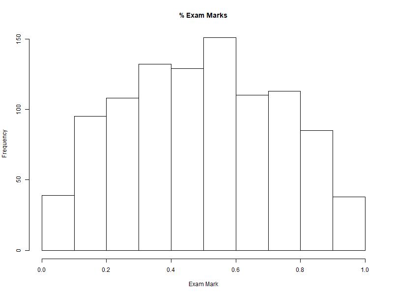
For
this demonstration, we’re going to look at the distribution of university exam marks
for all classes for a year. We have recorded 1000 marks and we see the following
histogram:
We’re
asked to find the probability that a student will earn a 70% or higher.
To do that, we would need to have some sort of distribution function that roughly fits the histogram.
Again, we don’t have a Gaussian distribution, so we need to make our own. After brute forcing a few quadratic equations in excel with intercepts 0 and 1 (-x)(6x-6), I find the following curve that seems to loosely fit the histogram.
\(f(x) = -6x^2+6x\)

If
I take the density plot of our sample data, and then place the new function next
to it, I get
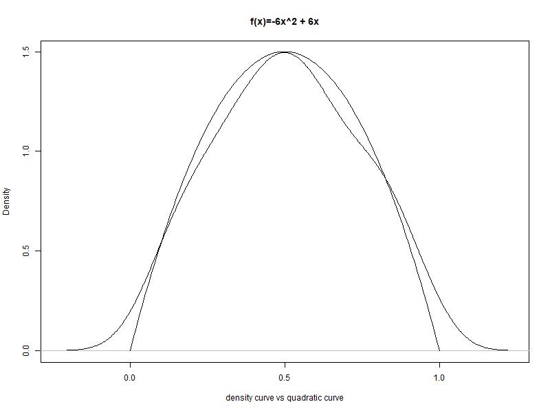
Not
bad. Not perfect, but good enough for this task. So we have a function, and the
area under the function’s curve matches roughly the density of our histogram. Visually,
we need to find the following – the area in red represents our probability P(x
> 70%):

Note that 70% on the x axis is not the same a .7 in terms of probability as the
curve and the histogram are not linear in area. Before
we find this shaded area, we need to check whether this custom curve of ours has
an area summing up to 1.0. All the probability distributions curves should sum
to 1.0, so we need to check if ours does too:
Our function
Integration
\[ \int_0^1 -6x^2+6x\;\mathrm{d}x \]
\[ \int_0^1 -\frac{6}{2+1}x^{2+1}+\frac{6}{1+1}x^{1+1}\;\mathrm{d}x \]
\( -2x^3 + 3x^2 + C\)
Now to subtract 0 from 1.0
\( -2(1)^3 + 3(1)^2 \) - \( -2(0)^3 + 3(0)^2 \)
\( -2 + 3 = 1 \)
Our area sums to 1.
Now
we that we have a solution, we will try to find the probability of the shaded
area of our toy quadratic function.

We
need to subtract the AUC 0.7 from 1 (We’re removing the blank area left of the line from the whole curve leaving us the red area)
So AUC 0.7 is :
So AUC 0.7 is :
\( ( -2({0.7})^3 + 3(0.7)^2) - ( -2(0)^3 + 3(0)^2 ) \)=-0.686+1.47=0.784
And
so the red area is 1 - 0.784 = .216
Therefore, the chances of a student having an exam mark higher than 0.7 is .216
Great! But what if we’re to ask the likelihood of a measure being higher than .9 or some other value? We would have to compute the AUC all over again. This is a lengthy process. However, I’ve built a cumulative table on paper instead:
X P(X)
X P(X) X
P(X) X
P(X)
0.01 0.000298 0.26 0.167648 0.51 0.514998 0.76 0.854848
0.02 0.001184 0.27 0.179334 0.52 0.529984 0.77 0.865634
0.03 0.002646 0.28 0.191296 0.53 0.544946 0.78 0.876096
0.04 0.004672 0.29 0.203522 0.54 0.559872 0.79 0.886222
0.05 0.007250 0.30 0.216000 0.55 0.574750 0.80 0.896000
0.06 0.010368 0.31 0.228718 0.56 0.589568 0.81 0.905418
0.07 0.014014 0.32 0.241664 0.57 0.604314 0.82 0.914464
0.08 0.018176 0.33 0.254826 0.58 0.618976 0.83 0.923126
0.09 0.022842 0.34 0.268192 0.59 0.633542 0.84 0.931392
0.10 0.028000 0.35 0.281750 0.60 0.648000 0.85 0.939250
0.11 0.033638 0.36 0.295488 0.61 0.662338 0.86 0.946688
0.12 0.039744 0.37 0.309394 0.62 0.676544 0.87 0.953694
0.13 0.046306 0.38 0.323456 0.63 0.690606 0.88 0.960256
0.14 0.053312 0.39 0.337662 0.64 0.704512 0.89 0.966362
0.15 0.060750 0.40 0.352000 0.65 0.718250 0.90 0.972000
0.16 0.068608 0.41 0.366458 0.66 0.731808 0.91 0.977158
0.17 0.076874 0.42 0.381024 0.67 0.745174 0.92 0.981824
0.18 0.085536 0.43 0.395686 0.68 0.758336 0.93 0.985986
0.19 0.094582 0.44 0.410432 0.69 0.771282 0.94 0.989632
0.20 0.104000 0.45 0.425250 0.70 0.784000 0.95 0.992750
0.21 0.113778 0.46 0.440128 0.71 0.796478 0.96 0.995328
0.22 0.123904 0.47 0.455054 0.72 0.808704 0.97 0.997354
0.23 0.134366 0.48 0.470016 0.73 0.820666 0.98 0.998816
0.24 0.145152 0.49 0.485002 0.74 0.832352 0.99 0.999702
0.25 0.156250 0.50 0.500000 0.75 0.843750 1.00 1.000000
And
now that we have a table, we can plot a cumulative density plot:

If
I were to publish my density function, I’d likely stick this table in the back
of the paper (or book) so the reader would merely have to apply the table instead of
needing to know integral calculus.
Let us test it:
What is P(x > 70%)? (probability of a sample having an exam mark of 70% and above?)
The table has .784 for 70% (0.7)
1-.784 = .216
What is P(x > 90%)?
1-.972 = .028
What
is P(70% < x < 90%)?
P(x > .9) – P(x > .7) = .972 - .784 = .188
The mean and variance
Here I work out the mean E(Y) and variance E(Y^2) of distribution.
From Wackerly's Mathematical Statistics - mean:
$$\text{E(cX)=cE[g(y)]}$$
Therefore
\[ \int_0^1 x(-6x^2+6x)\;\mathrm{d}x \]
\[ \int_0^1 -6x^3+6x^2\;\mathrm{d}x \]
\[ \int_0^1 -\frac{6}{3+1}x^{3+1}+\frac{6}{2+1}x^{2+1}\;\mathrm{d}x \]
$$( -1.5x^4 + 2x^3 + C)$$
$$( -1.5(1)^4 + 2(1)^3) - ( -1.5(0)^4 + 2(0)^3)=.5$$
So the mean is .5
From Wackerly's Mathematical Statistics - variance:
$$\text{Variance is }E(Y^2)$$
Therefore
\[ \int_0^1 x^2(-6x^2+6x)\;\mathrm{d}x \]
\[ \int_0^1 -6x^4+6x^3\;\mathrm{d}x \]
\[ \int_0^1 -\frac{6}{4+1}x^{4+1}+\frac{6}{3+1}x^{3+1}\;\mathrm{d}x \]
$$( -1.166x^5 + 1.5x^4 + C)$$
$$( -1.166(1)^5 + 1.5(1)^4) - ( -1.166(0)^5 + 1.5(0)^4)=0.333$$
The variance is .333
In Conclusion
Unlike a real distribution, our function has no tuning parameters, meaning we cannot move the height owing to variance or change the shape to accommodate a measure as one would find with a normal distribution. I might try incorporating one later but the toy distribution above has served its purpose.
So what is the take away here? Well, if I have some random process that generates measures between 0 and 1, and my histogram roughly matches a symmetrical and fat bell curve that is seen in this post, I can use the above table to get the likelihood of a measure occurring.
Lastly, distribution functions are not distributions themselves. They are an analytic tool that allows us to profile or box a data distribution and allow us to quantify the space below the line and make likelihood calculations about the data that fits the profile. The tables in the back of the books are done for us so we don’t have to integrate those distribution functions as I have hopefully highlighted in this post.
R Code
#Sample data
samples <- c(replicate(1,0)
,replicate(2,.05)
,replicate(5,.1)
,replicate(6,.15)
,replicate(7,.2)
,replicate(8,.25)
,replicate(9,.3)
,replicate(10,.35)
,replicate(11,.4)
,replicate(12,.45)
,replicate(13,.5)
,replicate(12,.55)
,replicate(11,.6)
,replicate(10,.65)
,replicate(8,.7)
,replicate(8,.75)
,replicate(8,.8)
,replicate(7,.85)
,replicate(5,.9)
,replicate(3,.95)
,replicate(2,1))

#Histogram
hist(sample(samples,1000,replace = T), main="% Exam Marks",xlab="Exam Mark")

#Density
plot(density(sample(samples,1000,replace = T)))

#The curve function
myCurve <- function(x)
{
return (-6*x^2 + 6*x)
}

#Plot the curve
plot(seq(0,1,.01),myCurve(seq(0,1,.01)),type="l", xlab="x", ylab="f(x)", main="f(x)=-6x^2 + 6x")

#Plot the curve and the density function
plot(density(samples), xlab="density curve vs quadratic curve",main="f(x)=-6x^2 + 6x")
lines(seq(0,1,.01),myCurve(seq(0,1,.01)),type="l", xlab="x", ylab="f(x)=-6x^2 + 6x")

#Cumulative AUC of integral
myAuc <- function(x) {
return ((-(2)*(x^3))+((3)*((x)^2)))
}

#Lookup table
dfX <- data.frame(x=seq(0,1,.01),prob=myAuc(seq(0,1,.01)))

#Cumulative distribution function
plot(dfX$prob, type="l", main="Cumulative Distribution", xlab="", ylab="")


